This site is being phased out.
Human vision vs. computer vision
This article compares the vision capabilities of humans and computers. The tests are very basic: detecting differences in contrast, intensity, length, etc. Humans are easy to fool...
Contrast
The image on the left reads “Hello!”. To see that, copy the “blank” image and sharpen it with any photo editing software (”Auto Contrast” in Photoshop). However, you need to do that only for the sake of humans - computers don’t need it! If you run Pixcavator, the result will be similar to the image on the right. As always, dark objects are captured with red contours, light with green.


Humans can only recognize about 30 levels of gray while standard image formats have 256. Since the text is in virtually white (254) on white (255) background, it is invisible.
One can think of this test as a most elementary example of optical illusion.
Computer can vary its contrast perception just like humans. The images below show how the number of objects declines as the contrast threshold increases: 0, 30, 50, 70, 125.


Luminosity
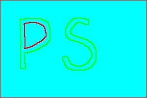
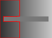
This last example was based on the failure to see small variations of luminosity (similar intensity but for color images). Now we have an almost identical example except it is based on the fact that humans can’t detect subtle variation of color (under fixed luminosity). The “blank” cyan rectangle below contains my initials “PS” which is found and displayed by Pixcavator on the right. The text written in color (0,254,255) – in the RGB channels - that is only slightly different from the background (0,255,254). It is invisible to us but not to the computer.

To verify that the image on the left contains the text you do need Photoshop again. This time Auto Contrast won’t help, but Smart Fix does work.
The classical optical illusions
Let's consider a few well known optical illusions (copied from Wikipedia). They do work as advertised. Then we try to see how Pixcavator handles them (it took just a few seconds for each).
First the grid illusion. Dark spots seem to appear in the crossings.
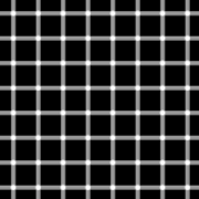
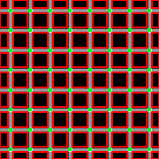
That one is easy. Pixcavator isn’t fooled at all – there are no dark spots! There are in fact light spots - captured with green.
Next, the faces-or-vase illusion.
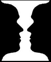
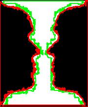
Pixcavator has found both the faces (dark objects) and the vase (light object), no problem.
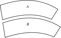
In the Ponzo illusion, the "farther" bar appears longer than the "closer" one.
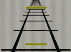
Pixcavator does not measure lengths directly but the perimeters of the bars are 170 and 176 (the computation of length is a bit tricky).
Similarly, in the Müller-Lyer illusion the middle arrow appears longer.
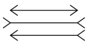
The perimeters according to Pixcavator are 682, 701, and 710.
In the Ebbinghaus illusion the brown circle on the left seems smaller that the one on the right.

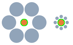
But the areas are 396 and 398.
The Jastrow illusion is even more extreme. The figures are clearly different!
But you can't fool the computer: the areas are 13365 and 13362, perimeters 596 and 595.
See also Measuring objects as well as Lengths of curves to see that this does not come easy.
Non-illusion illusions
In the “simultaneous contrast illusion”, the gray bar has the same gray level throughout.

Pixcavator does not handle this well. The reason is that it doesn't even recognize the bar as an object - it is neither dark on light nor light on dark.
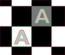
Now let’s take a look at the “same color” illusion. These letters have the exact same gray level, but one looks darker - in the second image. A common reaction is “OMG, it’s hard to believe! They look totally different!” The question is, is it a mistake to see them as different?
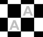
In my view, the fact that these letters have the same gray level is incidental. After all, they aren’t even close to each other. What is much more important is how each object fits into the image. What a person sees first is the relation between the object and the adjacent area (the background). The crucial difference is then that one A is dark on light background and the other is light on dark. It turns out, one is “dark” and the other is “light” – even though they have the same gray level! Why is this distinction so important? Look at it this way – the “dark” is an object while the “light” is a hole (or vice versa).
So what’s the conclusion? The two identical A’s look different because they are different! In fact, computer vision should follow human vision here and should be “fooled” by this “illusion”.
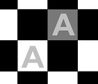
Analysis with Pixcavator is below: dark objects are red, light are green. Of course, the gray levels inside the objects are also captured, so Pixcavator isn't really fooled.
A similar optical illusion, right, came from here [1].


For another angle to human vs. machine and optical illusions, see Gestalt and computer vision.
More examples of image analysis here: Examples of image analysis.